01
The mark
Atria's primary mark is the circled "a" — a lowercase Atria Black "a" set inside a solid Atria Blue circle. It's self-contained and reads at any size, so it's the default: nav bars, favicons, app icons, avatars, anywhere the mark has to hold its own on its own. The full "atria" wordmark is the alternate — reach for it when there's room to spell the name out and a wordmark suits the context better, like a footer or a formal document header.
Reach for the icon mark by default — it's the primary signature. Use the full wordmark deliberately, when you want the name spelled out, not as a fallback for when the icon "feels too small."
02
Logo usage
Give the mark room to breathe, keep its proportions locked, and never fight it for attention. The rules below apply to every logo in this document — Atria's, Wren's, and Project Overwatch's alike.
Do
Scale proportionally, keep clear space around the mark equal to at least the height of the circle, and place it on a calm background.
Don't
Stretch, squash, skew, rotate, or otherwise distort the mark to fit a space. Resize the space instead.
Don't
Drop it onto a busy photo, pattern, or gradient that fights the mark for contrast.
Don't
Shrink the full logotype below ~24px tall, or the icon mark below ~16px — it stops reading. Use the icon mark for small spaces.
Don't
Recolor or reshape the circle, or use the "a" letterform without it. The circle is a fixed part of the mark — it must always be present, always a perfect circle, always Atria Blue.
Never recolor the mark outside of the pure-black or pure-white treatments shown above. The Atria Blue circle stays Atria Blue.
Clear space on solid backgrounds
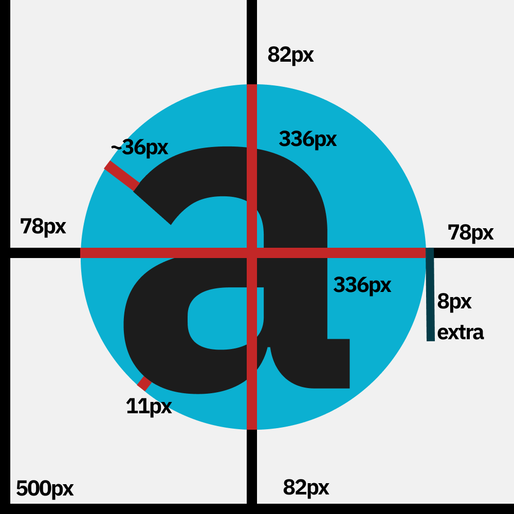
When the icon mark sits on a non-transparent background (not floating on its own transparent PNG), give the circle fixed clear space around it, measured on a 500px-square reference canvas: 78px on the left, 78px + 8px extra on the right, and 82px on the top and bottom. Scale these proportionally at other sizes.
- Reference canvas:
500px × 500px.
- Left clear space:
78px.
- Right clear space:
78px, plus 8px extra (86px total) — the mark sits very slightly left-of-center.
- Top and bottom clear space:
82px each.
- The circle fills the remaining space between those margins — see the annotated diagram for exact proportions.
03
Color
Three colors carry the whole brand: Atria Blue for accent and identity, Atria Black for type and dark surfaces, Atria White for light surfaces. Wren and Project Overwatch each carry one accent color of their own, used only inside their own product surfaces — never swapped in for Atria Blue on the main brand.
Atria Blue
#0BB0D1
Primary accent. Links, the logo circle, calls to action.
Atria Black
#1C1C1C
Primary text and dark section backgrounds.
Atria White
#F1F1F1
Primary page background. Warm off-white, not pure #FFF.
Wren Green
#1F3E12
Wren's accent only. See §Wren.
POW Indigo
~#615FFF
Project Overwatch's product accent.
Atria Blue, Atria Black, and Atria White are the only colors that belong to the main Atria brand. Everything else in this palette is scoped to one product and shouldn't wander into main-brand materials.
04
Typography
Two typefaces, two jobs. IBM Plex Sans JP, always bold, carries every headline, wordmark, and number that needs to command attention — it's rounded and confident on purpose. Lexend carries everything you actually read: body copy, UI labels, captions.
Display — IBM Plex Sans JP, Bold
Make the change.
font-family: "IBM Plex Sans JP"; font-weight: 700; letter-spacing: -0.025em;
Body — Lexend, Regular
Powerful, open, and free tools for online communities.
font-family: "Lexend"; font-weight: 400; line-height: 1.5;
Never use Display weights below 700 — the light and normal cuts of IBM Plex Sans JP don't appear anywhere in the live brand. Body copy stays light-to-regular (300–400); reserve medium/600 for small UI labels like nav links and buttons.
05
Wren
Product
Wren is Atria's AI companion, built into Discord and Roblox — it holds conversations, remembers server rules and facts about your community, answers through in-game DMs in ERLC, searches the web, and can be wired up to external agents over MCP. Docs live at wren.atriasafety.org.
Wren's mark is a line-drawn bird, no wordmark attached — pair it with the word "Wren" set in Display type when a name is needed. Its one accent color is Wren Green, used the same way Atria Blue is used for the main brand: never mixed into main-brand materials, and never replaced with Atria Blue inside Wren's own surfaces.
06
Project Overwatch
Product
Project Overwatch (POW) is Atria's live moderation platform for ER:LC Roblox servers — a real-time mod panel, a Discord bot, and a desktop OCR overlay running off one shared dataset. It lives at pow.atriasafety.org, docs at powdocs.atriasafety.org.
On atriasafety.org, POW is introduced in the black-and-white marketing style already live on the homepage: full-black hero, the white POW mark, huge Display type ("make the change"). Inside the product itself, the live app uses its own accent, POW Indigo — an informal, observed color rather than a locked hex, so treat it as directional.
Marketing surfaces (atriasafety.org, decks, social): black background, white mark, Display type. Product surfaces (the live app): POW Indigo as accent on a white ground. Don't cross the two.
This section covers the basics. For the full mark library, the "make the change" campaign spec, and the app-icon and menu-bar variants, see the full POW brand guide →
07
The sub-brand tag pattern
This pattern is reserved for genuine sub-brands — internal-facing rooms of the Atria site that aren't products in their own right, like the research library. research.atriasafety.org is the example: the full Atria logotype, plus a small outlined pill next to it naming the room. Wren and Project Overwatch are products, not sub-brands — they carry their own marks (see §Wren and §Project Overwatch) and shouldn't be tagged this way.
Live reference: the "Research" tag as built on research.atriasafety.org.
- Icon mark height
~28–32px, tag text uppercase, 0.08em letter-spacing, Lexend Medium.
- Pill:
1px solid border in the room's accent color, border-radius: 9999px, 2px 10px padding.
- Tag label text color sits one step darker than the accent for contrast (e.g. Atria Blue border with Atria Blue Dark text).
08
Vision 2100
Sub-brand — special case
Vision 2100 is a sub-brand, the same category as Research — an internal room under the main Atria identity, not a product with a logo of its own. What makes it special is that it skips the wordmark-plus-pill pattern from §07 entirely: it's a single long-form manifesto, not an ongoing site, so instead of a nav-bar tag it gets its own one-off hero treatment — an oversized, black-background hero with the title set enormous, tight, and mostly white, with one word carrying the Atria Blue accent. Treat this as the exception §07's pattern makes room for, not a second pattern to copy elsewhere.
Scaled-down reproduction of the live Vision 2100 hero at atriasafety.org/vision-2100/.
- Background
Atria Black, full-bleed, min-height ~100vh on the source page.
- Title: IBM Plex Sans JP, weight 700, size
clamp(7rem, 22vw, 22rem), line-height 0.82, letter-spacing -0.04em.
- Exactly one word or line carries
.accent (Atria Blue); the rest stays Atria White text.
- Two soft radial glows in Atria Blue at low opacity, top-right and bottom-left — texture, not focal points.
- Reuse this only for documents that function like a manifesto or charter. A product landing page is not this.
09
Website guidelines
The Atria site is built from a small set of repeating parts: a transparent nav that solidifies with a blur on scroll, alternating cream and black full-bleed sections, and pill-shaped buttons in two weights. Keep new pages inside this vocabulary rather than adding new component styles.
Navigation
Fixed, transparent over the hero, transitions to a blurred Atria White @ 95% bar with a 1px bottom border once scrolled past ~50px. Logo left, links + one primary button right.
Section rhythm
Sections alternate .section-cream and .section-dark (Atria Black, light text). Vertical padding scales from the spacing tokens — typically --space-24 to --space-32.
Buttons
Primary
Secondary
Always fully rounded (border-radius: 9999px). Primary is solid Atria Black on light backgrounds, solid Atria Blue on dark ones. Secondary is an outline that fills solid on hover.
Type scale & spacing
Both are token-driven — --text-xs through --text-hero, and --space-1 through --space-48 (0.25rem base, roughly 1.25–1.6× steps). Don't hardcode a size or gap that isn't already a token.
10
Document page template
Vision 2100 and this Brand page are the same template wearing different content. It's the pattern for any long-form, reference, or manifesto-style page that lives outside the homepage's single-scroll flow — use it instead of inventing a new layout the next time one of these comes up.
File structure
One self-contained public/<slug>/index.html per page, with its own <style> block re-declaring the site's design tokens — not an import from src/styles/. That keeps it a plain static file, deployable at a clean path without touching the Vite build.
Progress bar & nav
A 2px Atria Blue reading-progress bar pinned to the very top, filled by scroll percentage. Nav underneath: fixed, transparent over the hero, blurs to Atria White @ 95% past ~50px scroll — icon mark on the left, a plain text back-link to atriasafety.org on the right.
Hero
Full-bleed Atria Black, min-height ~80–100vh, an oversized Display-weight title with one accent word, two low-opacity Atria Blue glows for texture. Exact spec in §Vision 2100.
Foreword
A short cream band directly under the hero: a small accent-colored eyebrow label, then one intro paragraph capped at roughly 680px for a comfortable reading measure.
Article layout
Two columns: a sticky, numbered Table of Contents on the left with its active entry tracked via IntersectionObserver, and the doc-body on the right. Collapses to one column with a horizontal ToC under ~1100px.
Doc-section components
Each topic is a numbered .doc-section — Atria Blue index, Display heading, Lexend body capped at 70ch — separated by a top border. Pull-quotes, callouts, and spec lists are the shared building blocks inside it; reuse them rather than styling a one-off.
Motion
Every reveal uses the same [data-scroll] fade-up-on-intersect pattern, staggered with data-delay. There is no second animation style on these pages.
Footer
Identical to the main site's: icon mark, copyright and fiscal-sponsorship line, a flat row of text links.
11
Using these assets
Every logo and mark on this page belongs to Atria. Downloading a file here — every PNG is exported with a transparent background so it drops onto any surface cleanly — is not the same as being cleared to use it. Putting any Atria, Wren, or Project Overwatch mark on a product, publication, merchandise, or anything else public requires Atria's written permission first.
If you want to use one of these marks, need a different format, or aren't sure whether something here still applies, ask in the Discord rather than assuming.